Brief
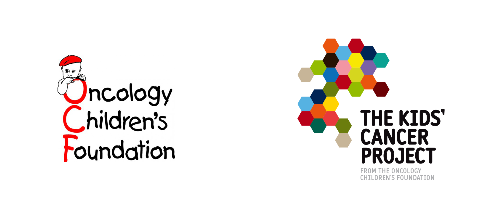
The Oncology Children's Foundation had a major image problem. In a market place suffering from charity fatigue, they looked outdated, tired and uninspiring.
Insight
People love to support charities in a visual way so that others around them can see. A quick look at the charity landscape and you can see various brands owning their look, ie; Pink is associated with Breast Cancer. We knew we had to create a unique look if we wanted to create a movement.
Result
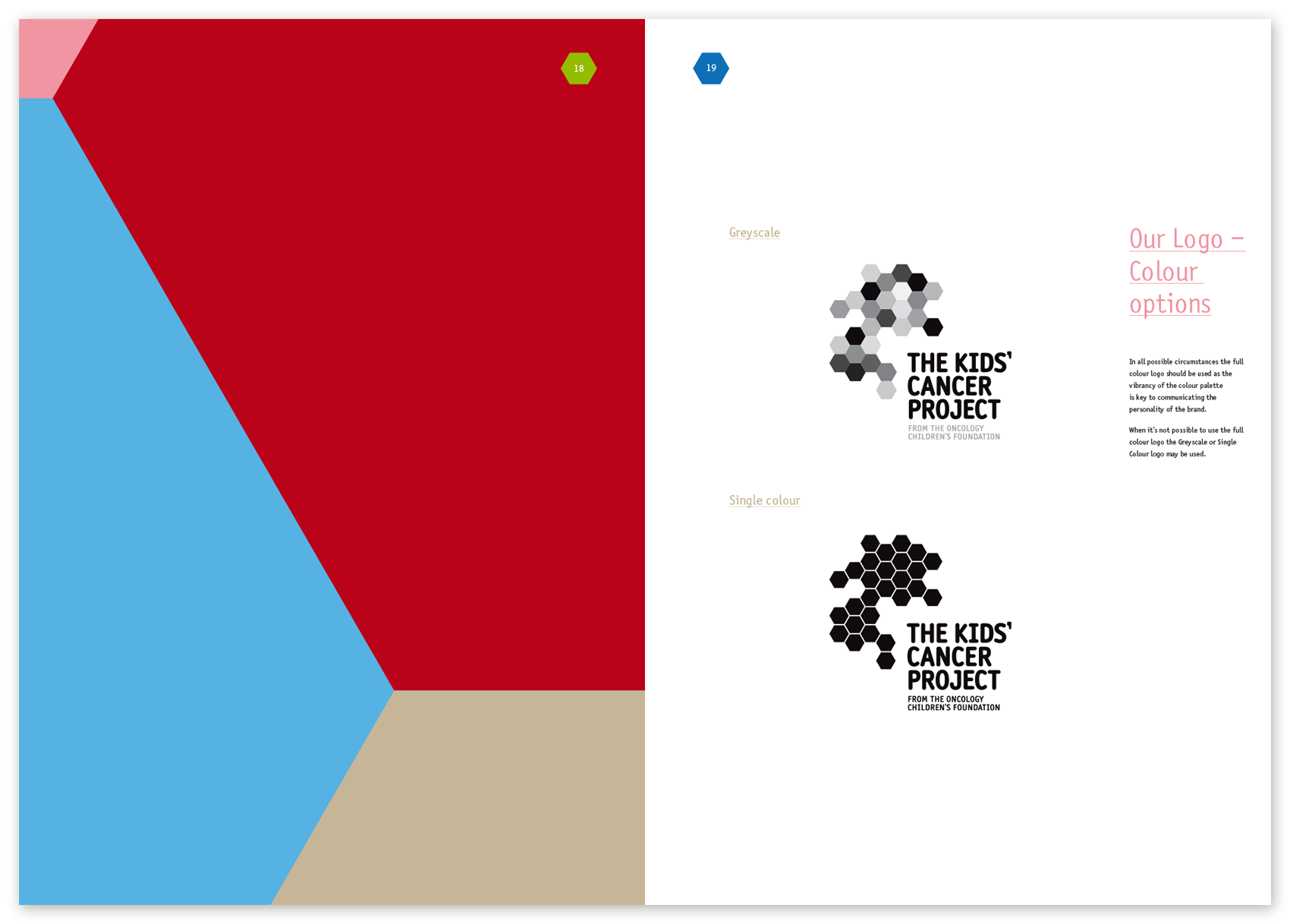
First we changed the name to 'The Kids Cancer Project', as research showed nobody understood what 'Oncology' meant. Then we created a striking, ownable new brand identity that reinforced their brand story.
The results were immediate with 2 new big brand sponsors jumping on board within the first two weeks.